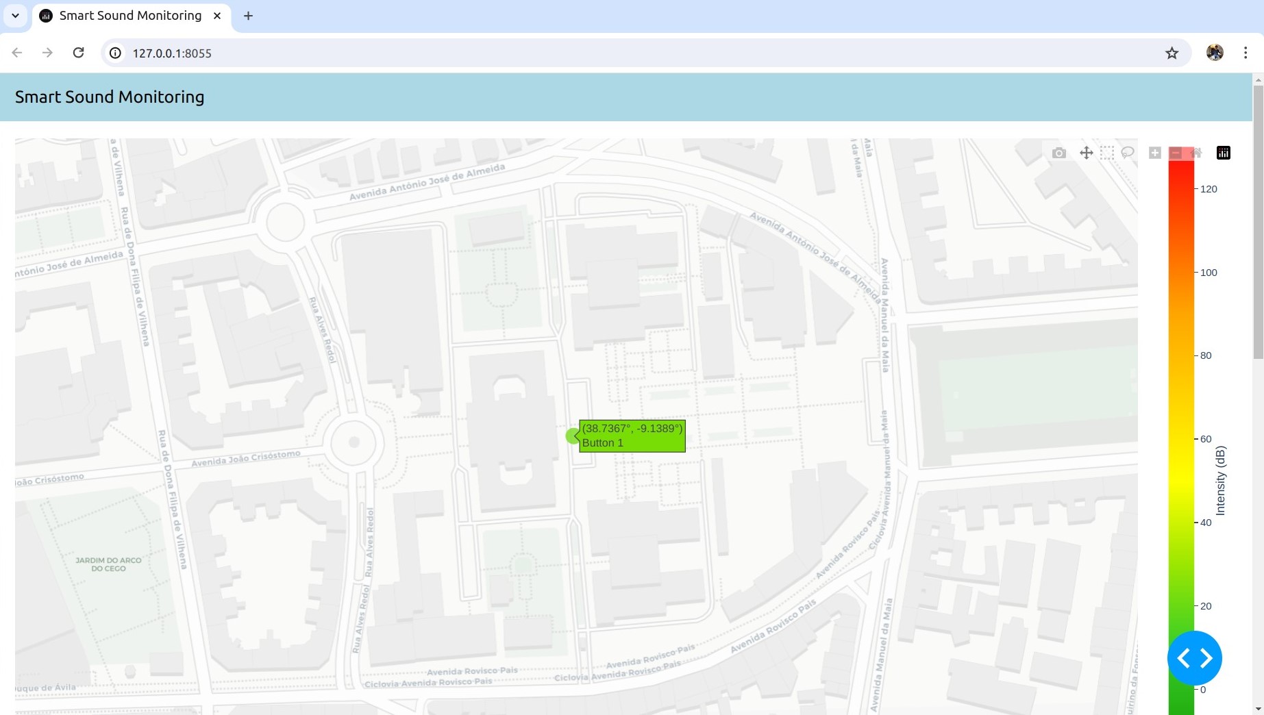
Over the course of the past two weeks, Nuno Jorge, with the help of Afonso Cruz, made considerable improvements in the Graphical User Interface. At the moment, to each location that indicates a (simulated) sound sample is associated a button, which, when pressed, shows the unilateral spectrum of the acquired signal. These locations are identified by a small circle whose color varies from green to red depending on the maximum intensity measured at that location.
However, we could not find any downloadable interactive world map that could replace the Plotly API, in order to make our application local, as we originally intended (the options we came across either did not possess the features we need or required too much memory space). Considering the time shortage we are facing, we made the decision to direct our efforts towards a Local Web App, which runs locally, in the user’s machine, while using the Plotly API. This decision was approved by Professor Rafael Cordeiro.
We have been dealing with a few issues related to the communications, so we still were not able to incorporate it in the GUI. That is our main goal for next week.